
Introduction
Problem
Shopping for beer seems simple. With a market flooded with beers from all over the world and different beers being sold in stores and restaurants, how does someone choose what to get? Many people still find it difficult to find what they are looking for, thus making the beer buying experience poor.
Despite there being a few apps on the market, they still fall short, only partially addressing buying beer. Due to the lack of success from these applications suggests that there is a problem in the beer buying experience.
Solution
I created an app that shows users all the information beer drinkers are looking for in one place. This app allows users to quickly find their next beer without being overwhelmed by all the options out there. On BeerHero, users can browse beers easily with the beer explore page, quickly add beers to wishlists, create a beer taste profile to curate beers for their searches, and shop for beers all in one place.
Role
Product Designer
Product Strategy, User Research, Interaction, Visual design, Prototyping & Testing, Information Architecture
March 2020 - March 2021
Research
Secondary Research
Working in a brewery, I found many people commenting on how difficult it was to find and buy beer that they enjoyed. Having this base knowledge, I wanted to dive deeper online to see if this was a problem beyond the people I ran into at work.
My first goal was to learn more about beer drinkers and how they typically go about learning and shopping for beer. I conducted my research through 5 different articles online that focused on beer data and trends. Through these articles; I could identify beer buying was difficult for more than just brewery customers.
FINDINGS ABOUT SHOPPING/FINDING BEER CONCERNS
There is a surplus amount of beer options in the current market.
Through this saturated market, there is a lack of descriptions for beers.
Beer drinkers want an easier way to find a beer they will like.
WHAT ARE PEOPLE LOOKING FOR IN BEER
Taste - Beer drinkers are most interested in what a beer will taste like.
Price - With single beers ranging from $1 to over $20, beer drinkers want something that lives up to the price.
Style - Beer drinkers also value buying a beer for its specific style. For example, buying a Pilsner on a hot day or specifically opting for trying something new as well as recommendations
Primary Research
I first created a research plan to help stay on track in the beginning stages of the creation of my app. After, I sent out a screener survey hoping to find suitable candidates to interview. I sent my survey to 2 Facebook groups, one for “beer enthusiasts” and one for “casual beer fans”. The goal was to get a good representation from all beer drinkers to avoid curating the app to one type of beer drinker.
After receiving over 120 responses on my screener survey, I went through and selected 5 participants from each survey group to interview. I selected participants if they researched beers before shopping, found shopping for beer to be difficult, and if they asked for help while shopping for beer. After synthesizing my screener responses, I created 5 research questions to focus on while I conducted my interviews. I interviewed the 10 participants in person or via video chat.
FINDINGS ABOUT SHOPPING/FINDING BEER CONCERNS
Why are people having a difficult time shopping for beer?
What are the top three things people are looking for when shopping for beer?
How do most people go about shopping/finding beer?
How long do people usually shop for beer?
If people knew more about beer styles, would they try new styles?
Synthesizing Research
Affinity Map
Across both interview groups, I found similar responses. To organize the information I collected from the interviews, I used the affinity mapping method to organize each data point into categories, where I identified 9 major themes:
Improve description of the beer
How I learn about beer
Price of the beer
Buying single beers over variety packs
Where is the beer in the store?
Use of other beer related apps/websites
Miscellaneous

Affinity Map created using Miro
Empathy Map
Using the data from the interview, I created an empathy map to learn more about what users may feel, think, say, and do.

Empathy Map created using Miro
Personas
As a result, I created 2 personas based on the type of user identified in the empathy map. After interviewing the participants recruited from the Facebook group for “beer enthusiasts,” I created one persona “Enthusiast Eric.” Similarly, after I interviewed the “casual beer fans” I created a second persona “Social Sam.” I made these personas to reference while creating BeerHero.

“Beer enthusiast” interview group persona, made using Sketch

“Casual beer fans” interview group persona, made using Sketch
What I learned
To summarize the synthesis, I found that there are at least 2 types of users with specific needs and priorities. Some users care more about quality beers and craft beers, while some care more about convenience and quantity. Despite this, there are still some commonalities.
Common Concerns:
Confusing/lack of description
Wasting money
Buying a bad beer
Common Motivations:
Recommendations
Buying an aesthetic beer can/bottle
Learning more about beer
Reframing the problem
From these insights, I could find a better way to frame the problem using How Might We? questions. I asked myself...
How might we improve how people learn about beer?
How might we help people find the beer that suits users' tastes?
How might we provide a simple yet thorough description for each beer?
How might we improve the in-store shopping experience?
Ideation
Brainstorming
I wrote out my HMW questions and came up with potential solutions. I spent 10 minutes coming up with as many solutions as I could for each HMW question. After looking over all my data, I organized and prioritized my potential solutions and created user stories.
User Stories
From my brainstorming, I wrote user stories to find my minimum viable product (MVP). I accomplished this by writing out user stories from the eyes of the personas created earlier. I found the MVP by finding which story had the most priority, highest value, lowest risk, and the shortest time estimate.
Minimum Viable Product
I identified three key features that should be the MVP for my solution:
As a beer drinker, I want to have a wishlist beer page so that I can have an accessible place to view several beers while shopping.
As a beer drinker, I want to have a suggestion for me to try a page so that I can see other beers I may like.
As a beer drinker, I want to have beer descriptions be simple and easy to read and understand so that I can make a quick and easy decision on a beer.

Key features (blue), specific steps in order to create the key feature (pink), and UI and UX elements inside each sub feature (yellow)
Site Map
These user stories allowed me to draw out a site map where I determined what pages and sub-pages to create to allow the users to perform tasks along their user flows.

Site map for 4 user flows: Explore page, Beer Wish List, Suggested to try page, and Beer Description page. Made using Miro
User Flows
After clearly defining the user stories and the site map, I could map out 4 user flows that were crucial for the app:
Logging in
Creating wishlists
Searching for beer
Beer product page (layout for all beer products)
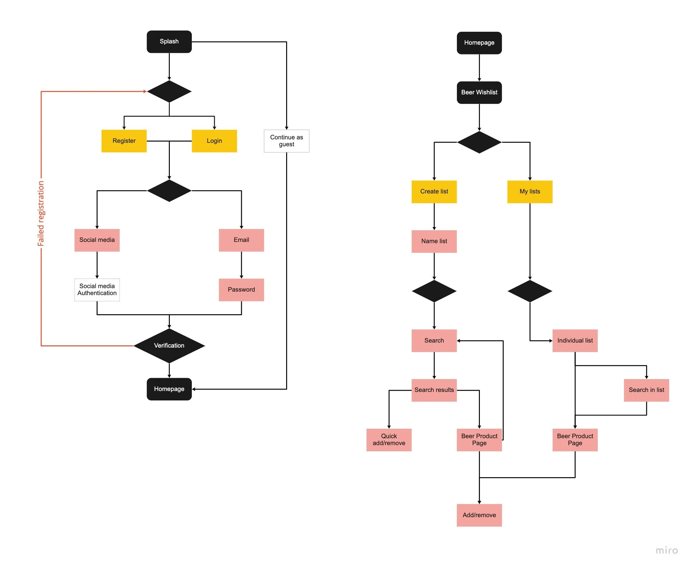

4 user flows made using Miro
Heuristic Analysis of Competitors
In this last stage of the ideation phase, I conducted a heuristic analysis of the competitors: Untapped, BeerAdvocate, and Beer Menus. The analysis was based on these 3 criteria:
Consistency and Standards
Aesthetic and Minimalist Design
Recognition vs. Recall
Taking a closer look into these apps allowed me to see where I could succeed where other apps had not.
Design
Sketches
I sketched out the low-fidelity screens for those 4 user flows identified.

Sketches for a splash page, wishlist page, beer product page, and a search page
Guerrilla Usability Test
Before I created the wireframes, I wanted to determine what problems users might encounter while completing 3 major tasks on the app.
Open app and use the search function
Open search filters
Create a list
So, I turned the sketches into a clickable low fidelity prototype using InVision and went out to conduct guerilla usability tests with 5 participants recruited from a social media post
The following usability issues came up regarding...
Few screens to navigate through
Confusion about the difference between Home and the Beer Explore page
Users wanted an option to see pricing for beer
Users wanted more out of the app
I took this feedback and applied changes to my wireframes.
Wireframes
I created the digital wireframes on Sketch after making the changes based on the feedback from the guerilla tests. These wireframes served as the anatomy of the app and helped figure out what worked and what didn’t without the pressure of being pixel perfect.

Lo-Fi sketches made using Sketch
Visual Design
My visual design was based around trying to make the user feel comfortable and calm. For colors, green is calming because of its shorter wavelengths as well as symbolizing optimism, motivation, and luck. The goal was to have users look at BeerHero and think, “I can find my next beer here.”
For images, I went with the iconic green beer bottle and images that show coziness. I want users to use this app casually anywhere, which is where the assortment of scenic images come from. For the high fidelity design stage, I started by creating the brand platform where I defined the name of the app BeerHero, the brand personality, and a mood board that communicated that personality. This mood board served as a reference that helped me create a style guide where I defined the visual language of BeerHero.

BeerHero style guide made using Sketch
High Fidelity Screens
The style guide helped me quickly iterate the high fidelity screens that were consistent with the brand personality and felt cohesive throughout the whole app. I kept the layouts clean and made the elements easy to identify by following the heuristics of similar apps.

Above: Onboarding, created in Sketch
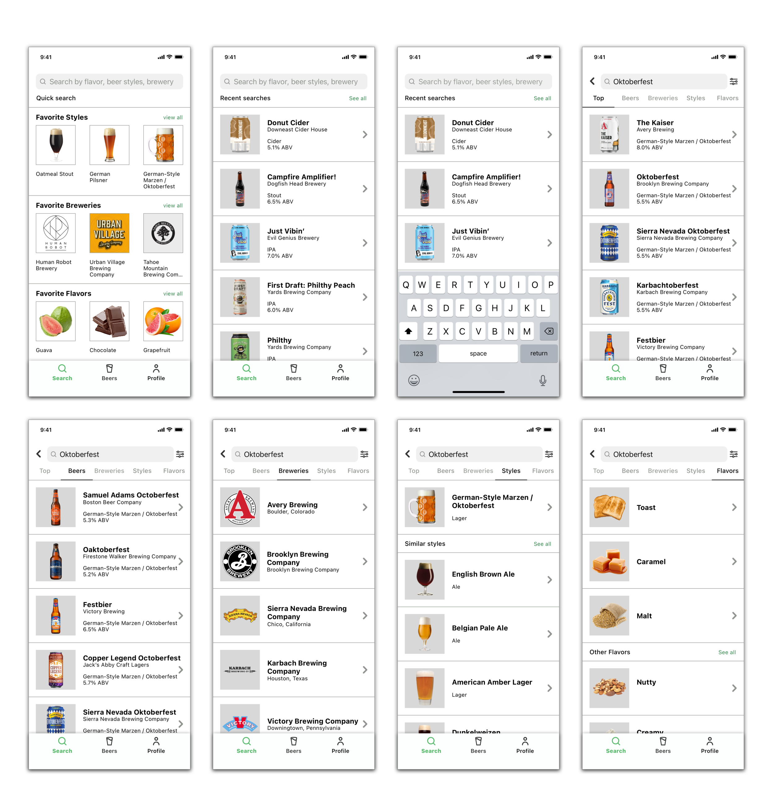
Above: Search function, created in Sketch

Above: Wishlist, created in Sketch
Prototype 1
With these high fidelity designs, I created an interactive prototype and went out to conduct a usability test with 5 participants. I performed the first round of usability testing on this prototype.


I created Prototype 1 on InVision Studios
Prototype 2
I created an interaction of my first prototype after the feedback from my first usability test. For my newly iterated prototype, I wanted to make a few design changes, one of them being a bidirectional scrolling navigation on the beer home page. By doing this, I needed to switch over to Figma, as InVision did not allow bidirectional scrolling. I performed the second round of usability testing on this prototype.


I created prototype 2 in Figma
Evaluation
First Round of Usability Testing
Overall, users seemed to navigate through the app fairly easily, with a few distinct problems to note. Almost all the users wanted to scroll on the home page. On the search page, users found a few differences between the homepage and the search homepage. While in the search results, the users questioned how some of the results shown would come up and that it seemed too complex. Many of the users, while looking at a beer product page, liked all the information present but wanted to know specifically the cost or if they could buy the beer.
Final Round of Usability Testing
Participants liked the design and ease of use. Users enjoyed the added design to see the prices on the beer product page. The participants also found the horizontal and vertical scrolling to be intuitive. The combination in design on the beer home page and the search page created a streamline system for users to search more easily. Users still requested more description within the app. From more sub topics on the beer explore page and more descriptive text in the beer product page. It goes to show that a quote from early on in the interview process still holds true, “Can never be too descriptive.”
Conclusion
In the end, I created an app that shows users all the information beer drinkers are looking for in one place. This app allows users to quickly find their next beer without being overwhelmed with all the options out there. On BeerHero, users can browse beers easily with the beer explore page, quickly add beers to wishlists, create a beer taste profile to curate beers for their searches, and shop for beers all in one place.
What I learned
Empathizing with users
Interviewing users about their experiences with their process in buying beer offered insights into what problems I should prioritize and focus on so that the app would be useful for them. This process also revealed the difference between what they say bothers them about the beer buying process and what they do when they are actually buying beer.
Value of Feedback from Users
Conducting usability tests with participants offered great insights into how and why different individuals approach each task in their own way. The tests also revealed a lot about what UI elements confused the users and what features I could add to improve the experience.
Next Steps
In the future, I plan to conduct an A/B test to determine whether having the current quick link to create a new list is better than a new design. Some users spent more time than others to locate the icon/link. Possibly, making a more noticeable link will create a better user experience.